daikazu / filament-image-checkbox-group
Image-based checkbox group component for FilamentPHP
Fund package maintenance!
:vendor_name
Installs: 83
Dependents: 0
Suggesters: 0
Security: 0
Stars: 0
Watchers: 1
Forks: 0
Open Issues: 0
Language:Blade
Requires
- php: ^8.3
- filament/forms: ^3.2
- filament/support: ^3.2
- illuminate/contracts: ^10.0||^11.0||^12.0
- spatie/laravel-package-tools: ^1.16
Requires (Dev)
- larastan/larastan: ^2.9||^3.0
- laravel/pint: ^1.14
- nunomaduro/collision: ^8.1.1||^7.10.0
- orchestra/testbench: ^10.0.0||^9.0.0||^8.22.0
- pestphp/pest: ^3.0
- pestphp/pest-plugin-arch: ^3.0
- pestphp/pest-plugin-laravel: ^3.0
- phpstan/extension-installer: ^1.3||^2.0
- phpstan/phpstan-deprecation-rules: ^1.1||^2.0
- phpstan/phpstan-phpunit: ^1.3||^2.0
- spatie/laravel-ray: ^1.35
README
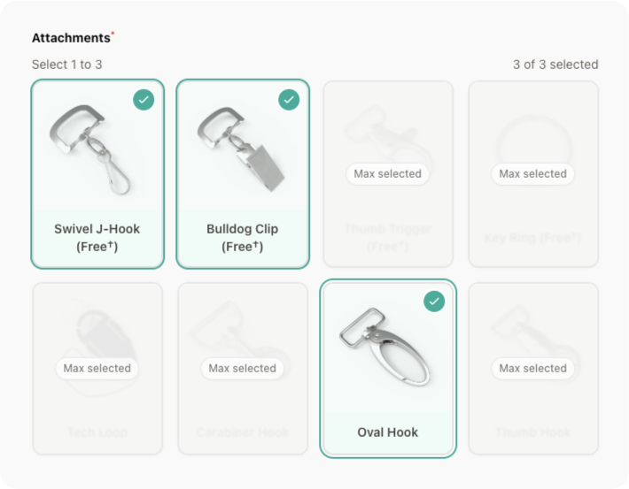
A custom form component for FilamentPHP v3 that displays checkbox group options as image-based selectable buttons.
Features
- Styled as buttons instead of traditional checkboxes
- Contains an image and an optional label for each option
- Allows multiple selections
- Supports
minandmaxselection constraints - Optional requirement validation with min/max enforcement
- Emits selected values to Livewire as an array
- Styled options as cards with hover/active states
- Prevents selecting more than max items
- Reusable as a custom form field
- Full keyboard accessibility support
Installation
You can install the package via composer:
composer require daikazu/filament-image-checkbox-group
Tailwind Configuration
Add the package's view path to your Tailwind content configuration in tailwind.config.js:
module.exports = {
    content: [
        // ... other content paths
        './vendor/daikazu/filament-image-checkbox-group/resources/views/**/*.blade.php',
    ],
    // ... rest of your config
};
You can publish the config file with:
php artisan vendor:publish --tag="filament-image-checkbox-group-config"
Optionally, you can publish the views using:
php artisan vendor:publish --tag="filament-image-checkbox-group-views"
Usage
use Daikazu\FilamentImageCheckboxGroup\Forms\Components\ImageCheckboxGroup;

// In your form schema
ImageCheckboxGroup::make('amenities')
    ->options([
        'wifi' => [
            'label' => 'Wi-Fi',
            'image' => asset('images/amenities/wifi.jpg'),
        ],
        'parking' => [
            'label' => 'Parking',
            'image' => asset('images/amenities/parking.jpg'),
        ],
        'pool' => [
            'label' => 'Swimming Pool',
            'image' => asset('images/amenities/pool.jpg'),
        ],
    ])
    ->required()
Grid Columns Configuration
The component supports two ways to configure the grid layout:
- Simple integer configuration:
ImageCheckboxGroup::make('amenities')
    ->options([...])
    ->gridColumns(4)  // Will create a responsive grid that grows up to 4 columns
- Detailed responsive configuration:
ImageCheckboxGroup::make('amenities')
    ->options([...])
    ->gridColumns([
        'default' => 1,  // mobile first (xs breakpoint)
        'sm' => 2,       // small screens (640px)
        'md' => 3,       // medium screens (768px)
        'lg' => 4,       // large screens (1024px)
        'xl' => 6,       // extra large screens (1280px)
        '2xl' => 8,      // 2xl screens (1536px)
    ])
The responsive configuration supports these breakpoints:
default: Mobile first (< 640px)sm: Small screens (≥ 640px)md: Medium screens (≥ 768px)lg: Large screens (≥ 1024px)xl: Extra large screens (≥ 1280px)2xl: 2XL screens (≥ 1536px)
You can specify any combination of breakpoints. Unspecified breakpoints will inherit from the previous breakpoint:
ImageCheckboxGroup::make('amenities')
    ->options([...])
    ->gridColumns([
        'default' => 1,  // 1 column on mobile
        'md' => 3,       // 3 columns from medium screens up
        'xl' => 4,       // 4 columns from extra large screens up
    ])
With Min/Max Selection
ImageCheckboxGroup::make('amenities')
    ->options([
        'wifi' => [
            'label' => 'Wi-Fi',
            'image' => asset('images/amenities/wifi.jpg'),
        ],
        'parking' => [
            'label' => 'Parking',
            'image' => asset('images/amenities/parking.jpg'),
        ],
        'pool' => [
            'label' => 'Swimming Pool',
            'image' => asset('images/amenities/pool.jpg'),
        ],
    ])
    ->minSelect(1) // Must select at least 1
    ->maxSelect(2) // Cannot select more than 2
    ->required()
Without Images (Label-only buttons)
ImageCheckboxGroup::make('categories')
    ->options([
        'electronics' => 'Electronics',
        'clothing' => 'Clothing',
        'food' => 'Food',
        'books' => 'Books',
    ])
    ->gridColumns(2) // Show in 2 columns
    ->required()
Optional Selection
ImageCheckboxGroup::make('additional_features')
    ->options([
        'feature1' => [
            'label' => 'Feature 1',
            'image' => asset('images/features/feature1.jpg'),
        ],
        'feature2' => [
            'label' => 'Feature 2',
            'image' => asset('images/features/feature2.jpg'),
        ],
    ])
    ->maxSelect(3) // Optional but limited to max 3 selections
Configuration
You can configure default behavior for all instances of this component:
// config/filament-image-checkbox-group.php
return [
    'default_grid_columns' => 4,
    'default_min_select' => null,
    'default_max_select' => null,
];
Customization
Helper Text
Add helper text to guide users:
ImageCheckboxGroup::make('amenities')
    ->options([...])
    ->helperText('Select the amenities available at this property')
Validation
The component handles validation automatically:
- If the field is marked as
->required(), it will require at least 1 selection (or the number specified by->minSelect()) - If
->maxSelect()is set, it will enforce a maximum number of selections - If the field is not required, no minimum selection validation is applied, but the max limit is still enforced
Data Format
The component stores an array of selected values in your model:
// Example data in your model
public $amenities = ['wifi', 'pool'];
Examples
Property Amenities Selection
use Daikazu\FilamentImageCheckboxGroup\Forms\Components\ImageCheckboxGroup;

// In your form schema
Forms\Components\Section::make('Amenities')
    ->description('Select the amenities available at this property')
    ->schema([
        ImageCheckboxGroup::make('amenities')
            ->options([
                'wifi' => [
                    'label' => 'Wi-Fi',
                    'image' => asset('images/amenities/wifi.jpg'),
                ],
                'parking' => [
                    'label' => 'Parking',
                    'image' => asset('images/amenities/parking.jpg'),
                ],
                'pool' => [
                    'label' => 'Swimming Pool',
                    'image' => asset('images/amenities/pool.jpg'),
                ],
                'gym' => [
                    'label' => 'Fitness Center',
                    'image' => asset('images/amenities/gym.jpg'),
                ],
                'spa' => [
                    'label' => 'Spa',
                    'image' => asset('images/amenities/spa.jpg'),
                ],
                'breakfast' => [
                    'label' => 'Breakfast',
                    'image' => asset('images/amenities/breakfast.jpg'),
                ],
                'restaurant' => [
                    'label' => 'Restaurant',
                    'image' => asset('images/amenities/restaurant.jpg'),
                ],
                'laundry' => [
                    'label' => 'Laundry',
                    'image' => asset('images/amenities/laundry.jpg'),
                ],
            ])
            ->minSelect(1)
            ->maxSelect(5)
            ->required()
            ->gridColumns(4)
            ->helperText('Select between 1 and 5 amenities that best describe your property'),
    ]),
Testing
composer test
Changelog
Please see CHANGELOG for more information on what has changed recently.
Contributing
Please see CONTRIBUTING for details.
Security Vulnerabilities
Please review our security policy on how to report security vulnerabilities.
Credits
License
The MIT License (MIT). Please see License File for more information.

