juniyasyos / dash-stack-theme-juniyasyos
DashStack theme for filament php
Fund package maintenance!
Fa-BRAIK
Requires
- php: ^8.2
- filament/filament: ^3.0
- illuminate/contracts: ^11.0|^12.0
- spatie/laravel-package-tools: ^1.19
Requires (Dev)
- larastan/larastan: ^3.0
- laravel/pint: ^1.20
- phpunit/phpunit: ^11.0
README

Tested on Filamentphp demo app
Acknowledgements
Name based and Design inspired from DashStack Theme. Big thanks for Seju for this amazing design.
🚀 Installation & Usage (Auto Mode)
Step 1: Install the Package
Install the package using Composer:
composer require juniyasyos/dash-stack-theme-juniyasyos
Step 2: Run Install Command
This command will install required npm packages (if not already installed) and publish its assets.
php artisan filament-dash-stack-theme-juniyasyos:install
Step 3: Register Filament Plugin
Within your targeted panel provider, register DashStack Theme Plugin:
use Juniyasyos\DashStackTheme\DashStackThemePlugin;

// ...

$panel->plugin(DashStackThemePlugin::make());
🔧 Development Mode
Step 1: Publish Assets Manually
Run the following commands to publish the assets:
php artisan vendor:publish --tag=dash-stack-theme-juniyasyos-assets --force
php artisan vendor:publish --tag=dash-stack-theme-juniyasyos-dist --force
Step 2: Configure Vite Theme in Filament Panel
Modify your Filament Panel configuration and set the viteTheme path to:
->viteTheme('resources/css/filament/dash-stack-theme-juniyasyos/theme.css')
Step 3: Build the Assets
After making any modifications, run the following command to compile the assets:
npm run build
Development Notes
- Ensure that
vite.config.jsincludes the correct input path for the theme CSS. - After publishing assets, you may need to clear the cache using
php artisan config:clear. - If the styles are not reflecting, check if
npm run devornpm run buildhas been executed properly.
⚙️ Configuration
DashStack theme comes by default with a configuration for primary color and predefined dashboard settings. To customize, publish the config file:
php artisan vendor:publish --tag=filament-dash-stack-theme-juniyasyos-config
Example configuration (config/filament-dash-stack-theme-juniyasyos.php):
use Juniyasyos\DashStackTheme\Support\Colors\Color;

return [
    'default-colors' => [
        'primary' => Color::Blue,
    ],

    'side-bar-collapsable-on-desktop' => true,
    'collapsible-navigation-groups' => false,
    'breadcrumbs' => false,

    /**
     * Nunito Sans is the default font for the theme.
     */
    'use-default-font' => true,
];
Note: The default font used for Dash Stack Theme is Nunito Sans. You can disable this by setting
use-default-fonttofalsein the config file.
📌 Upcoming Features
If you have feature requests or suggestions, feel free to submit them on GitHub.
Planned Updates:
- Date / DateTime / DateRange component
- Enhanced Select component (UI improvements)
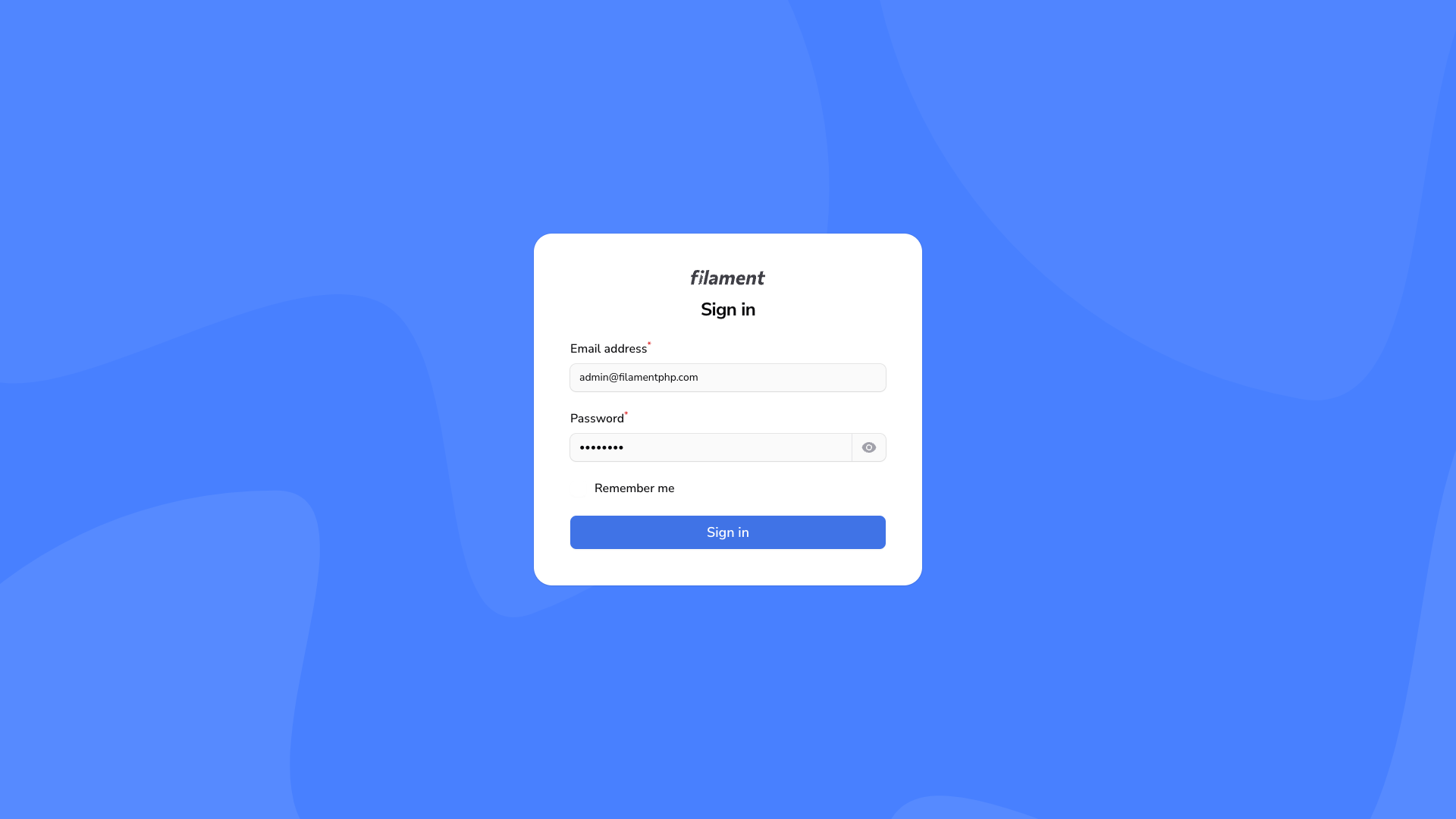
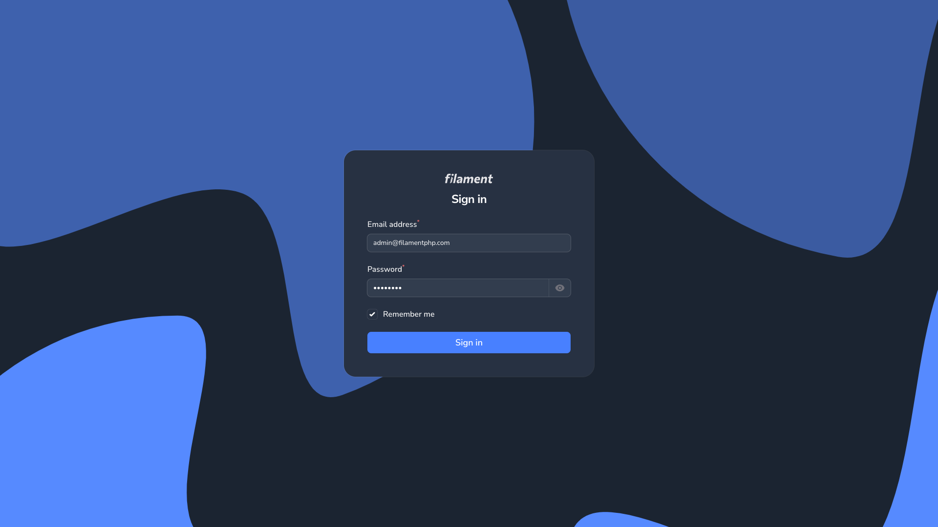
🎨 Appearance
Login Page
| Login Page Light | Login Page Dark |
|---|---|
|
|
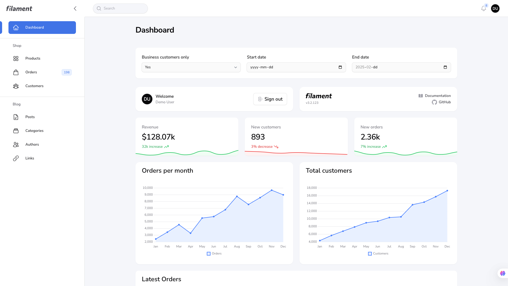
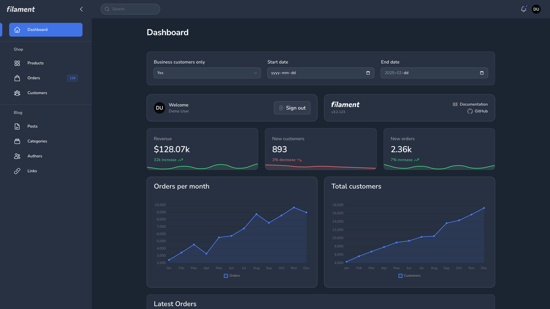
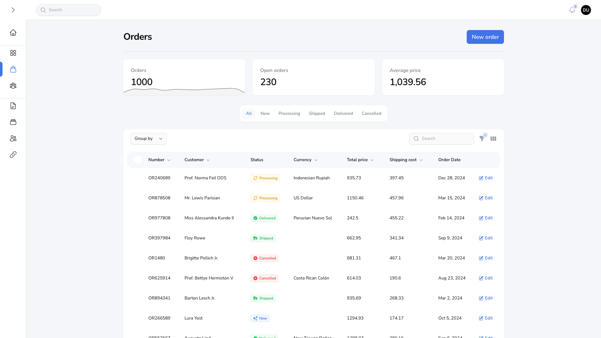
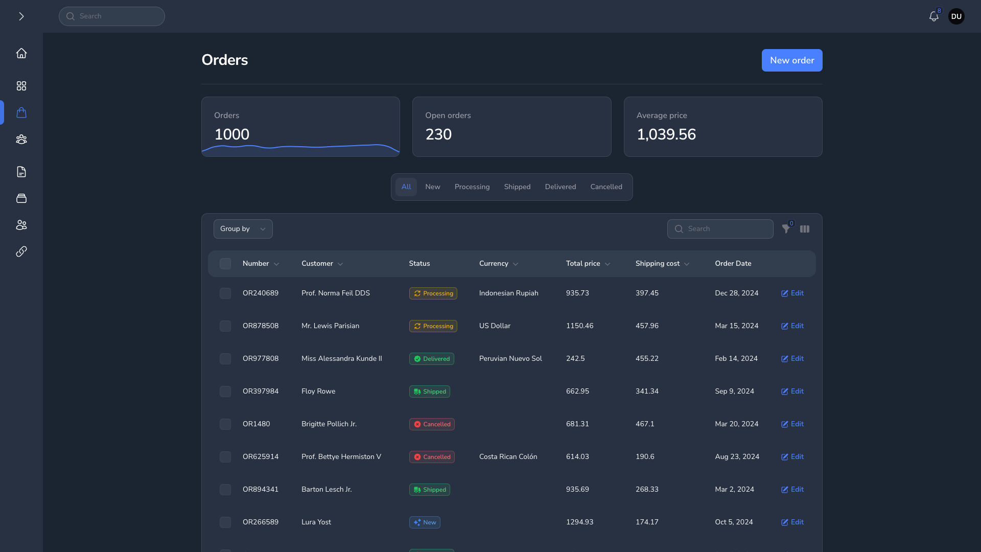
Dashboard Page
| Dashboard Page Light | Dashboard Page Dark |
|---|---|
|
|
Global Search
| Global Search Light | Global Search Dark |
|---|---|
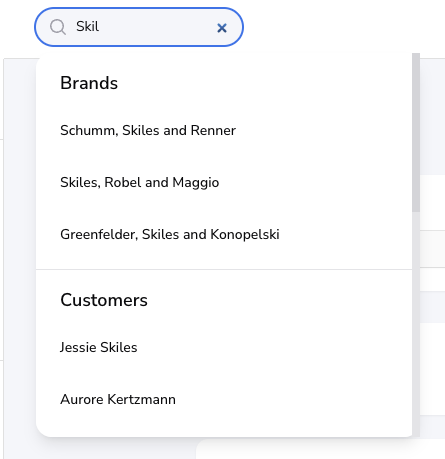
|
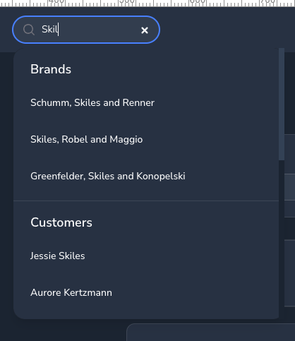
|
Notification Modal
| Notification Modal Light | Notification Modal Dark |
|---|---|
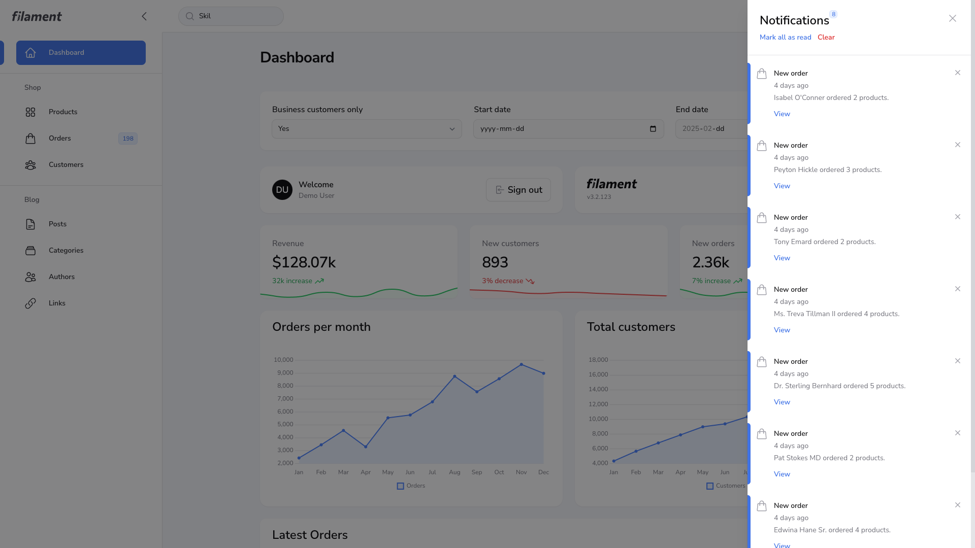
|
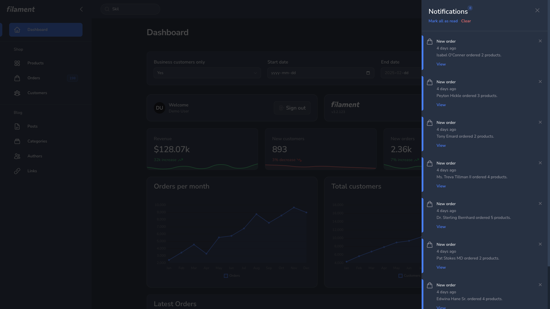
|
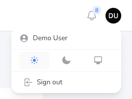
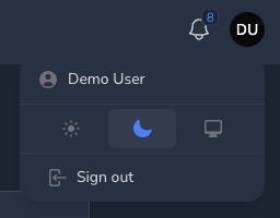
User Menu
| User Menu Light | User Menu Dark |
|---|---|
|
|
Resource Page
| Resource Page Light | Resource Page Dark |
|---|---|
|
|
Grid Table
| Grid Table Light | Grid Table Dark |
|---|---|
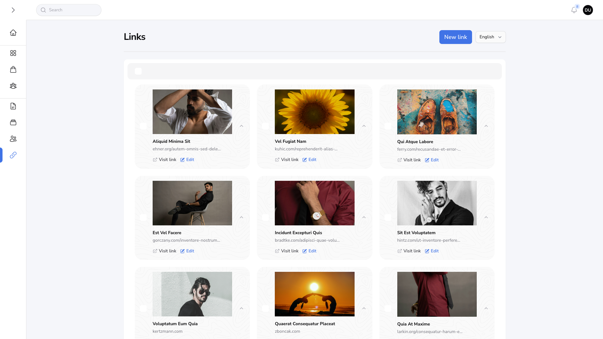
|
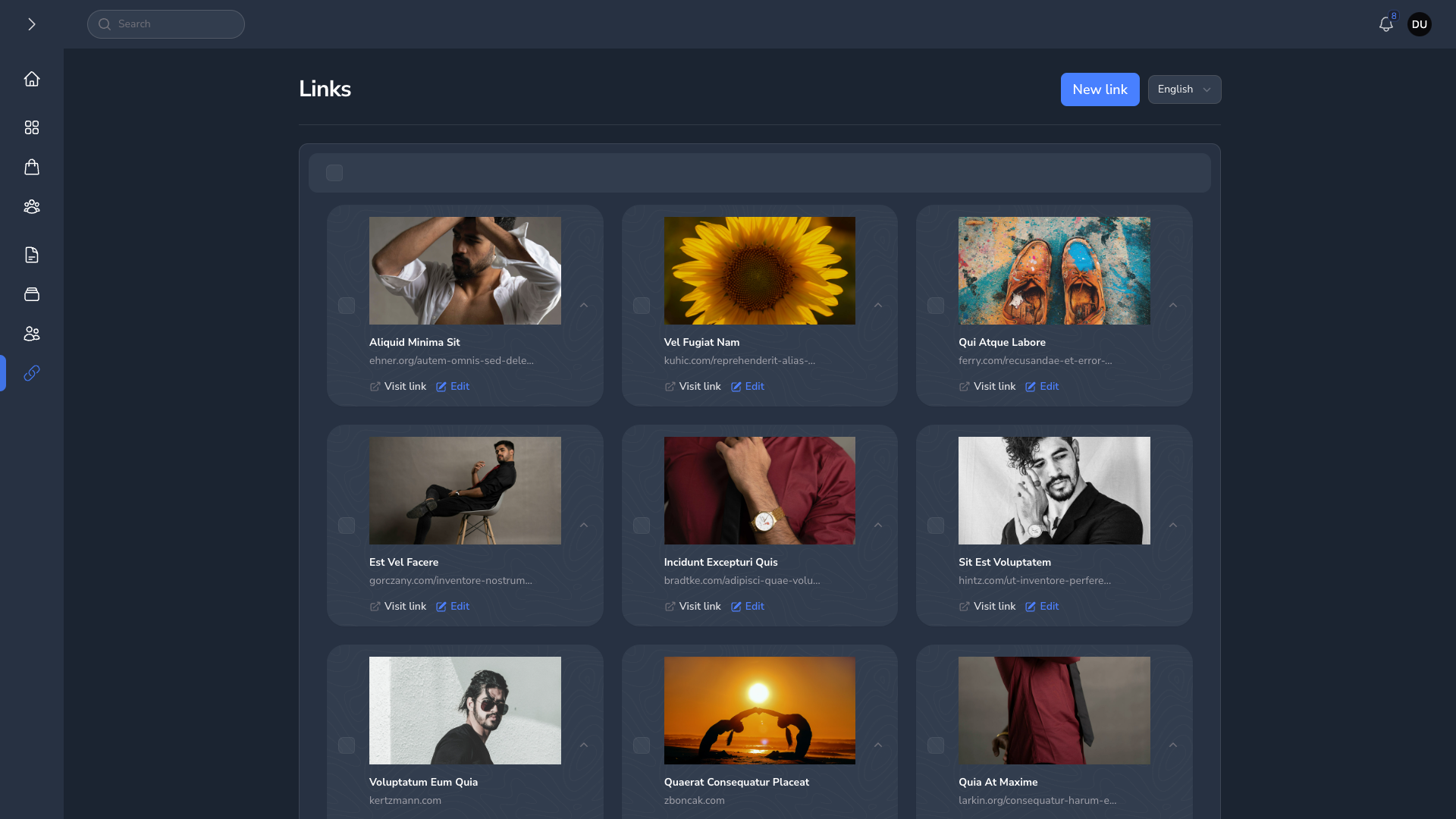
|
Forms
| Forms Light | Forms Dark |
|---|---|
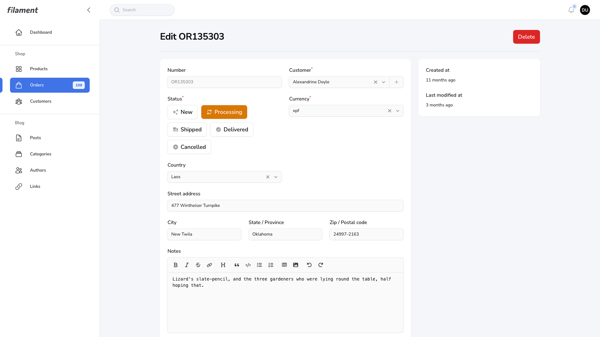
|
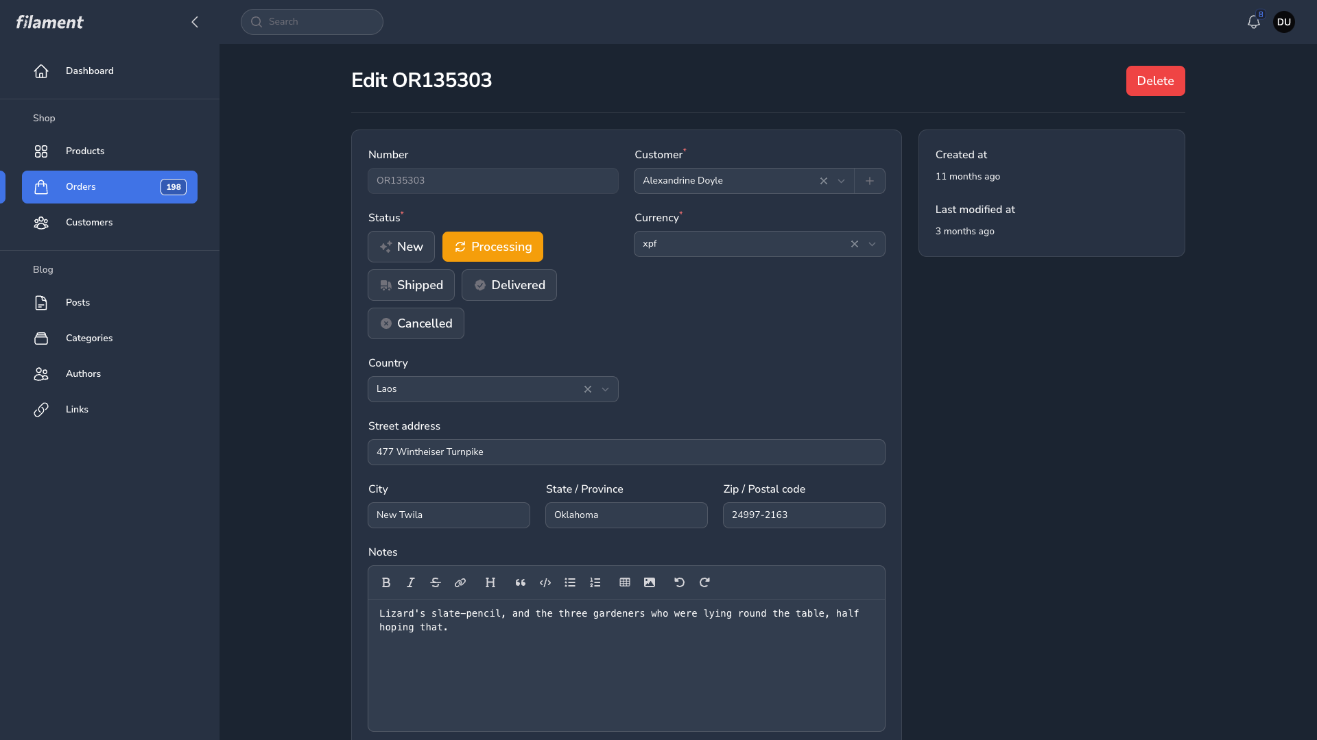
|