shel / neos-colorpicker
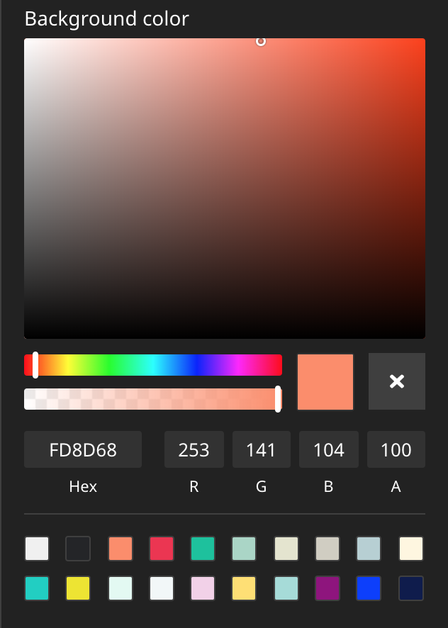
A plugin for Neos CMS which provides a colorpicker editor
Installs: 74 031
Dependents: 5
Suggesters: 1
Security: 0
Stars: 12
Watchers: 3
Forks: 7
Open Issues: 0
Language:TypeScript
Type:neos-plugin
Requires
- neos/neos: ^8.3 || ^9.0
- neos/neos-ui: ^8.3 || ^9.0
- dev-master
- 1.7.0
- 1.6.6
- 1.6.5
- 1.6.4
- 1.6.3
- 1.6.2
- 1.6.1
- 1.6.0
- 1.5.0
- 1.4.2
- 1.4.1
- 1.4.0
- 1.3.2
- 1.3.1
- 1.3.0
- 1.2.0
- 1.1.0
- 1.0.0
- dev-feature/neos9
- dev-dependabot/npm_and_yarn/Resources/Private/Scripts/ColorPickerEditor/neos-project/neos-ui-extensibility-5.0.1
- dev-dependabot/npm_and_yarn/Resources/Private/Scripts/ColorPickerEditor/neos-project/react-ui-components-5.0.1
This package is auto-updated.
Last update: 2025-03-27 10:05:33 UTC
README
Introduction
This package provides a Color Picker Editor which can be used in Neos CMS with the Neos.Ui 2+.
This editor is based on the example in https://github.com/neos/neos-ui-extensibility-examples but has some modifications in regards to styling, supports the alpha channel and has a reset button to unset a value.
Example
See it in action.
Installation
Run this in your site package
composer require --no-update shel/neos-colorpicker
Then run composer update in your project directory.
How to use
Add a property of type string and configure the editor as seen in this example:
Your NodeType:
"My.Site:Content.Text":
  superTypes:
    "Neos.Neos:Content": true
  ui:
    label: 'My text content'
  properties:
    textColor:
      type: string
      ui:
        label: 'Text color'
        reloadIfChanged: true
        inspector:
          group: 'text'
          editor: 'Shel.Neos.ColorPicker/ColorPickerEditor'
          editorOptions:
            # `mode` can be one of "rgba", "hsla", "hex", "preset", default: rgba
            mode: 'rgba'
            # Show saturation/hue/alpha (optional), boolean, default: false
            picker: true
            # Show hex/rgba fields (optional), boolean, default: false
            fields: true
            # Show preset colors (optional), array of colors or boolean (to disable)
            presetColors: ['#ff0000', '#0000ff', '#ffff00', ...]
            # OR you can show presetColors with alternative titles, that will be shown on hover
            # presetColors: [{color: '#ff0000', title: 'red'}, {color: '#0000ff', title: 'blue'}, {color: '#ffff00', title: 'yellow'}]
            # Hides the reset button if set to false
            allowEmpty: true
Your Fusion:
prototype(My.Site:Content.Text) < prototype(Neos.Neos:ContentComponent) {

  textColor = ${q(node).property('textColor')}

  renderer = afx`
    <div class="container" style={'color:' + props.textColor + ';'} style.@if.hasColor={props.textColor}>
        <h1>Hello World</h1>
        <p>Euismod massa quam arcu et mi arcu tincidunt maximus tortor lacus interdum vivamus cursus aliquam eget amet amet eget gravida et vivamus eget diam tortor.</p>
    </div>
  `
}
Customization
The editor allows some global default options via your Settings.yaml file:
Neos:
 Neos:
  Ui:
   frontendConfiguration:
    "Shel.Neos:ColorPickerEditor":
     # `mode` can be one of "rgba", "hsla", "hex", "preset"
     mode: "rgba"
     # Colors which are available for quick selection
     presetColors: ["#D0021B", "#F5A623", ...]
mode allows you to store the selected color values in a different format if needed.
This can be helpful, when the hsl format is needed to get the individual components.
presetColors lets you customize the list of color squares that are available for quick selection.
Advanced preset usage
The presetColors option can have two shapes.
One is just a simple list of color strings, the other one is a list of objects with a color (hex) and optional title and value properties.
color- the color (hex) that will be displayed in the preset color squarestitle- (optional) the text that will be displayed on hovervalue- (optional) the value that will be stored in the node property instead of the color value
The value can be used to store a value different from the presets color value.
This value is only used when the mode is set to preset which in turn will also disable the
color picker and the color fields.
The benefit of this option is that you can show a color value to the user but store a different value in the node property.
F.e. a CSS classname.
Contributions
Contributions are very welcome!
Please create detailed issues and PRs.

